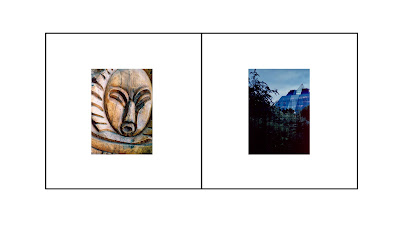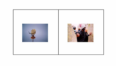

Thinking about layout, the above being rather influenced by the layout of Tony Evan's photos in English Sunrise as designed by David Hillman. The book is curiously modern in concept and presented with the attention to detail that makes viewing the book a great experience. Little things like how the pages open and the size of it in your hand. Simultaneously the book is really dated by the circular corners of the pictures, and the colour of the prints- I don't know whether the nostalgia trip was attended but it is a great lesson in design. In particular I like how the photographs are presented small, demanding an intimate viewing experience. I am working with a small format and creating book photographs as Alec Soth would have it. I want my photographs to be like icons, small and richly coloured prayers.